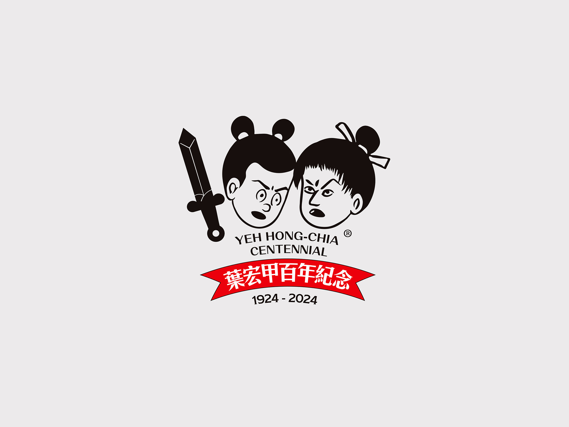
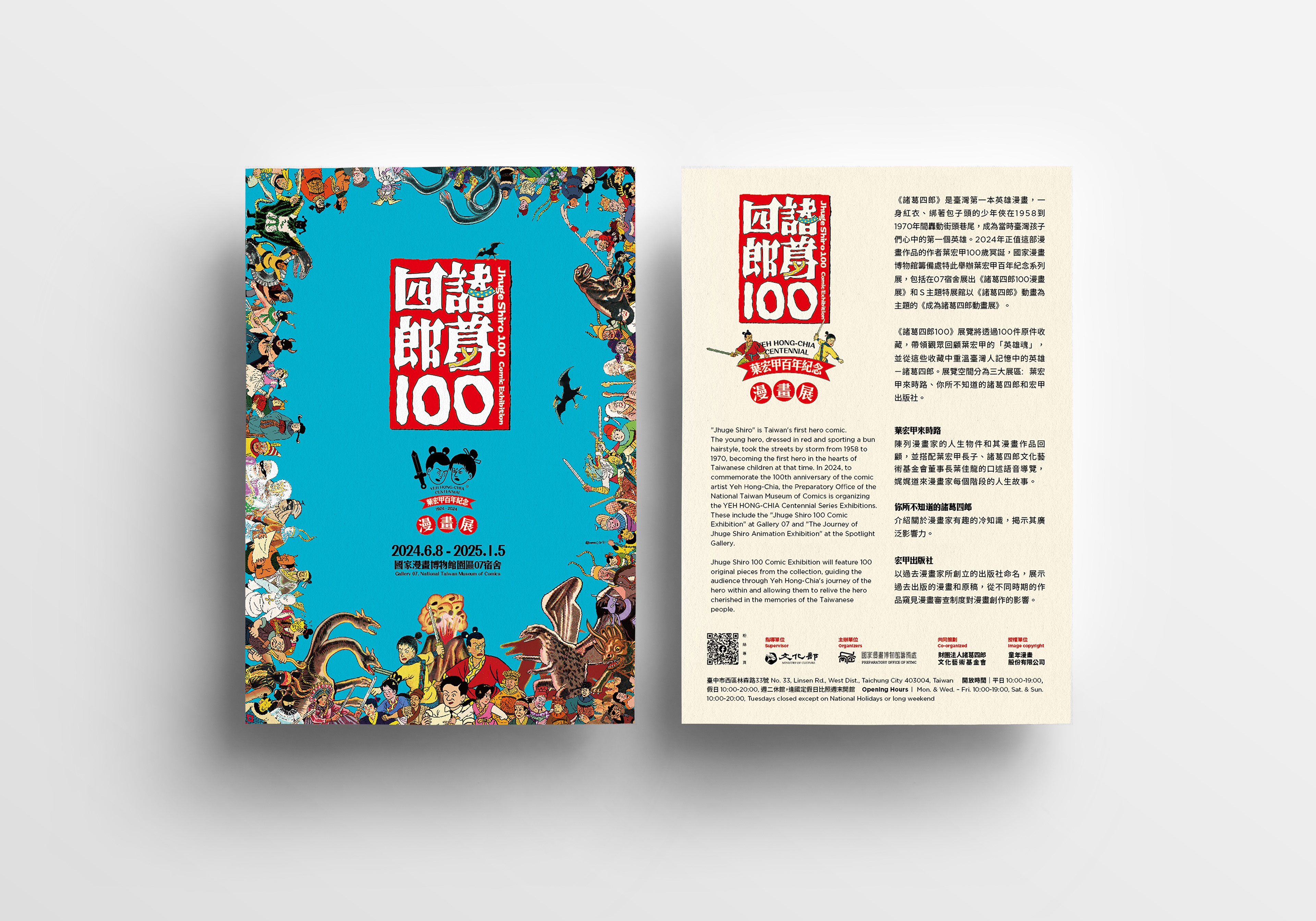
以葉宏甲代表過品諸葛四郎裡的兩位主要人物,作為100裡的0,而劍的元素在此漫畫中也具有一定的代表性,故已劍作為數字1,而下方葉宏甲百年紀念與漫畫展字樣,則是參考諸葛四郎漫畫封面的風格,將文字壓在紅色的橫幅緞帶(匾額)與圓圈裡,以電腦字體的微變形取代原漫畫封面的手寫字,這樣既能帶有漫畫家原畫風的元素,又能翻新整體的視覺感受。
Using the two main characters from Ye Hongjia’s representative work “Zhuge Silang” as the zeros in the number 100, and the sword element, which holds significant representation in this comic, as the number 1, the design integrates these iconic symbols. The text below, “Ye Hongjia Centennial Memorial and Comic Exhibition,” references the style of the “Zhuge Silang” comic covers, placing the text on a red horizontal ribbon (plaque) and within a circle. This design uses slightly modified computer fonts to replace the original handwritten text on the comic covers, thereby maintaining elements of the comic artist’s original style while refreshing the overall visual experience.
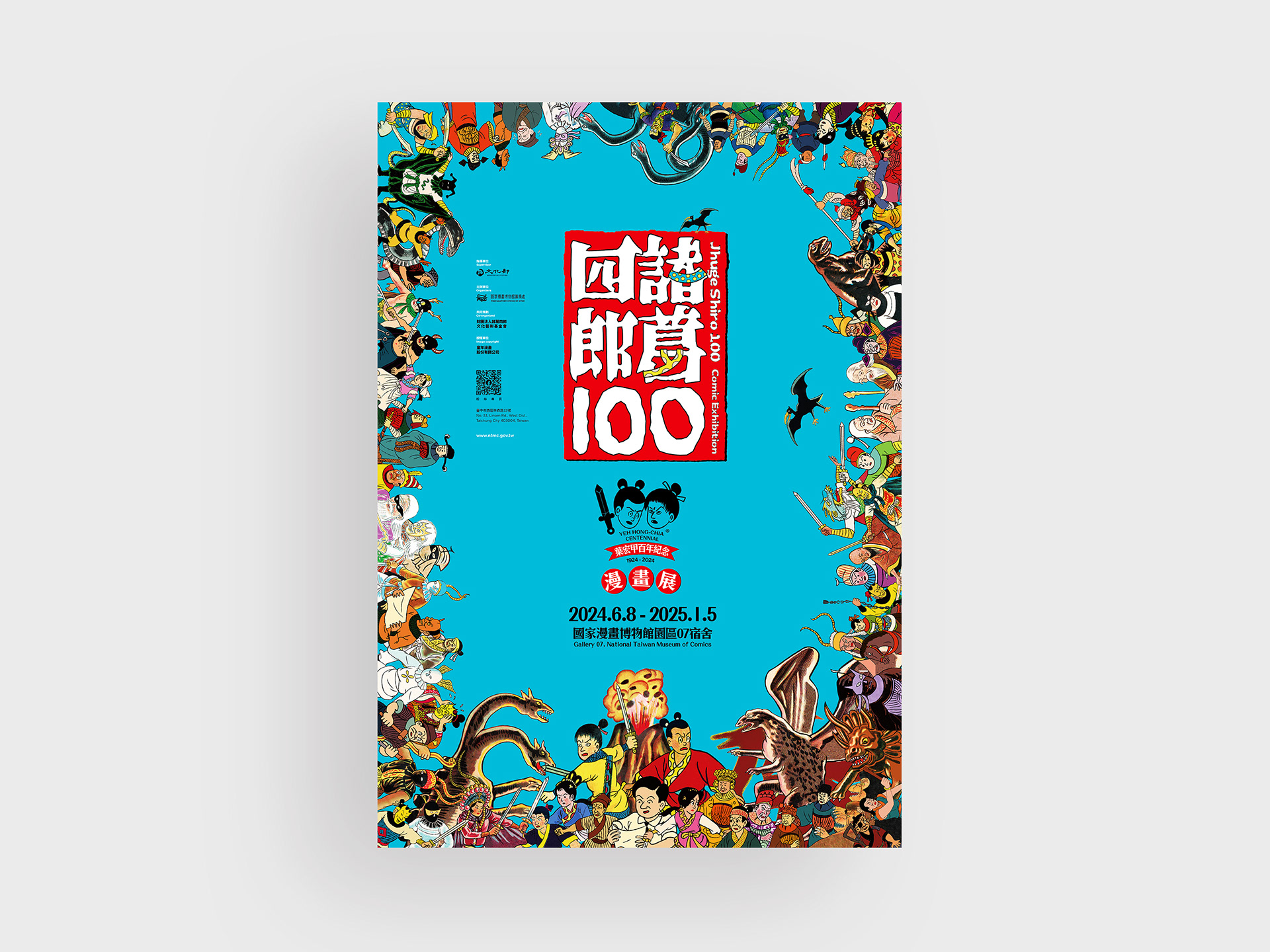
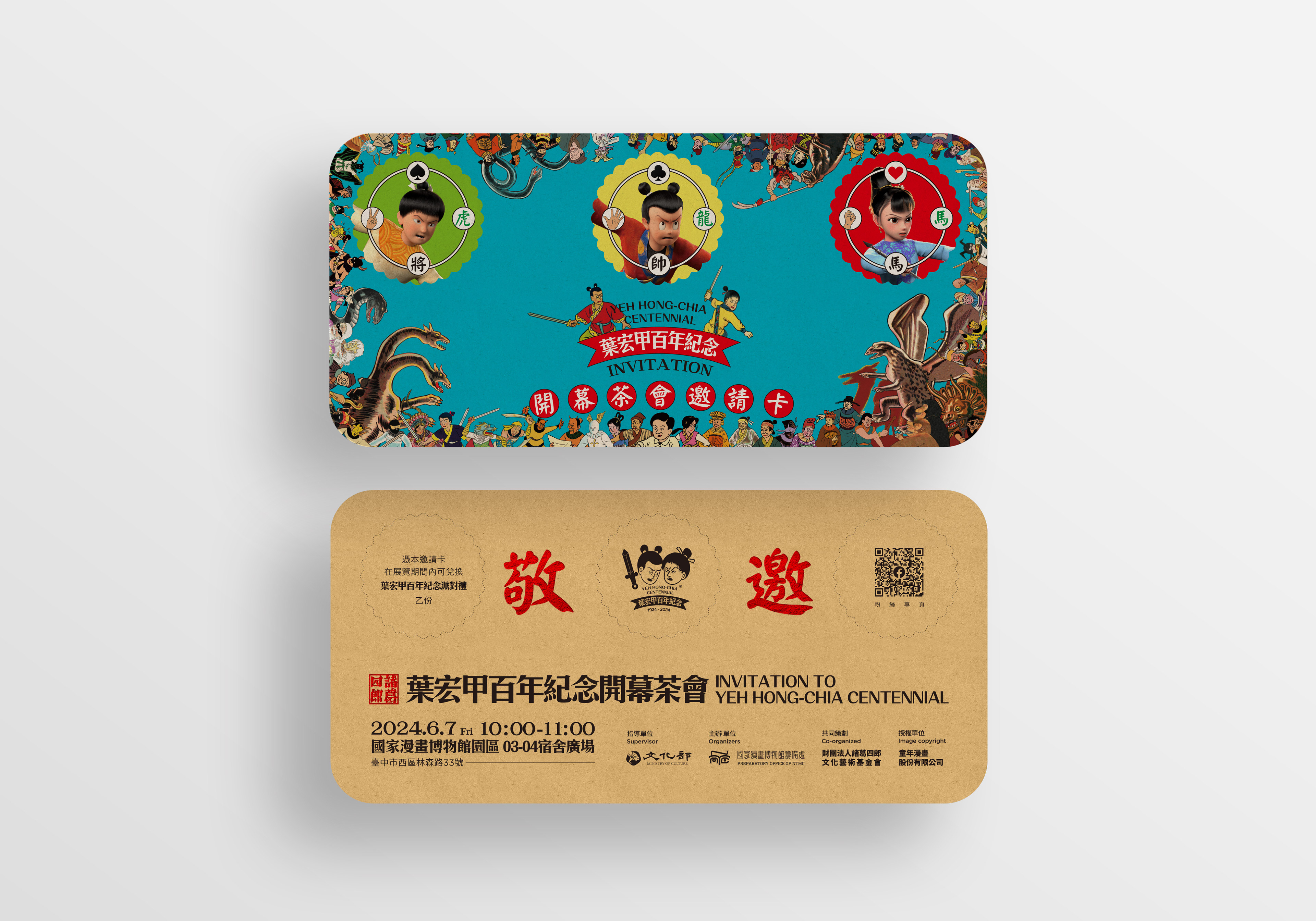
葉宏甲百年紀念-『諸葛四郎100』漫畫展
Huge Shiro 100 Comic Exhibition
2024.6.8-2025.1.5
國家漫畫博物館園區07宿舍
Gallery 07, National Taiwan Museum of Comics,
✦
臺中市西區林森路33號
No. 33, Linsen Rd., West Dist., Taichung City 403004, Taiwan
✦
✦
畫面四周展示該漫畫出現過的人物群像,形成一種繽紛的畫面,四周的角色不僅代表了漫畫中的多樣性,也反映了故事的豐富性和藝術的創造力。這些角色被安排在海報的不同位置,創造出一種動態和層次感,海報的色彩選擇和布局旨在喚起懷舊情感,同時也吸引新一代讀者的注意,海報的設計理念是將傳統與現代元素融合,通過視覺敘事來慶祝和回顧漫畫的歷史。
The poster’s surroundings display a collage of characters that have appeared in the comic, creating a vibrant scene. These characters not only represent the diversity within the comic but also reflect the richness of the story and the creativity of the art. They are positioned at various locations on the poster, generating a sense of dynamism and depth. The choice of colors and layout aims to evoke nostalgia while also capturing the attention of a new generation of readers. The design concept of the poster is to blend traditional and modern elements, celebrating and revisiting the comic’s history through visual storytelling.
〔設計/Designed〕和設計
〔年份/Year〕2024