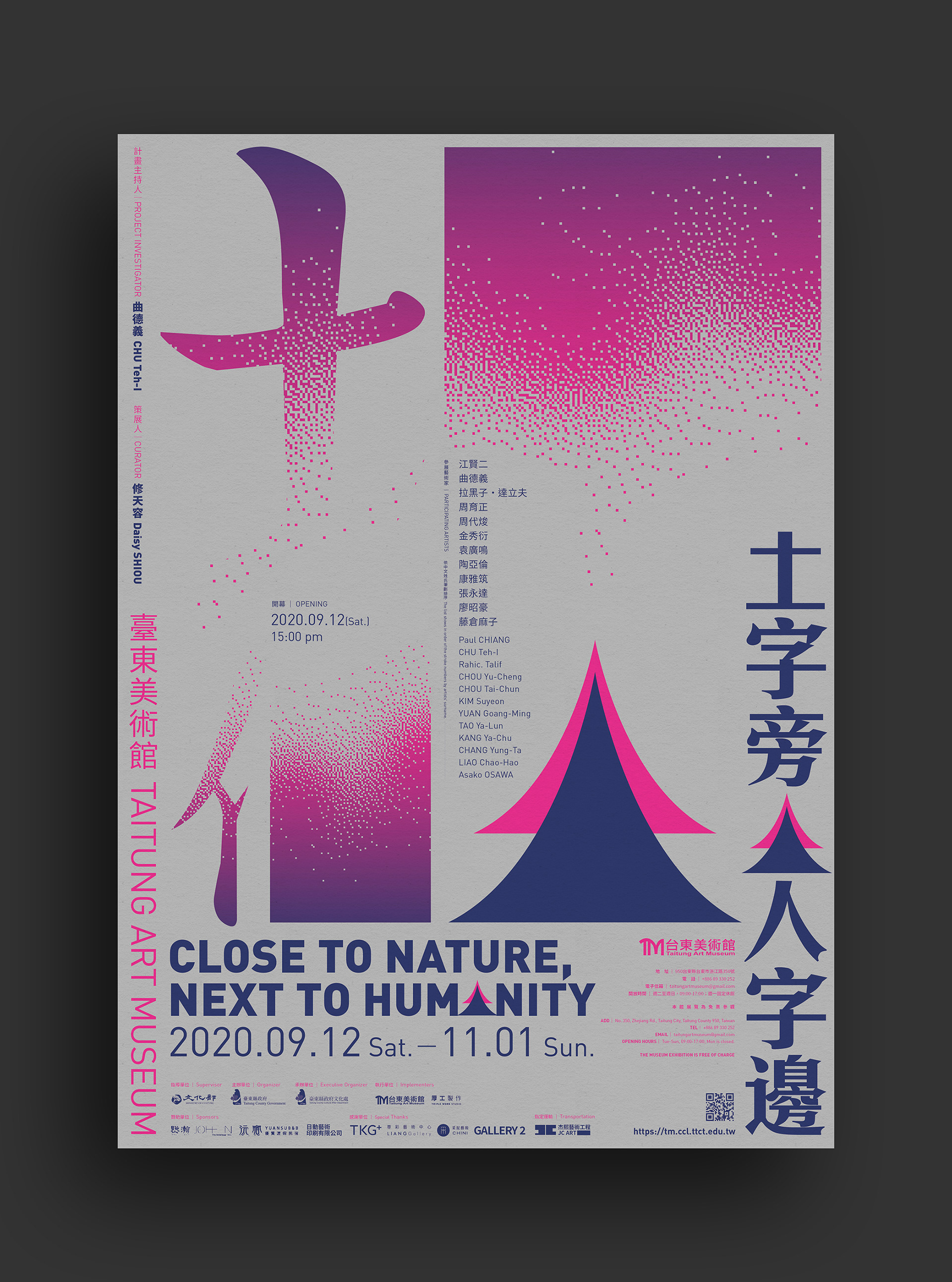
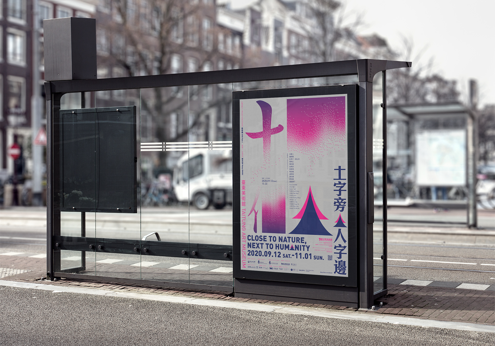
土字旁人字邊
Close to Nature, Next to Humanity
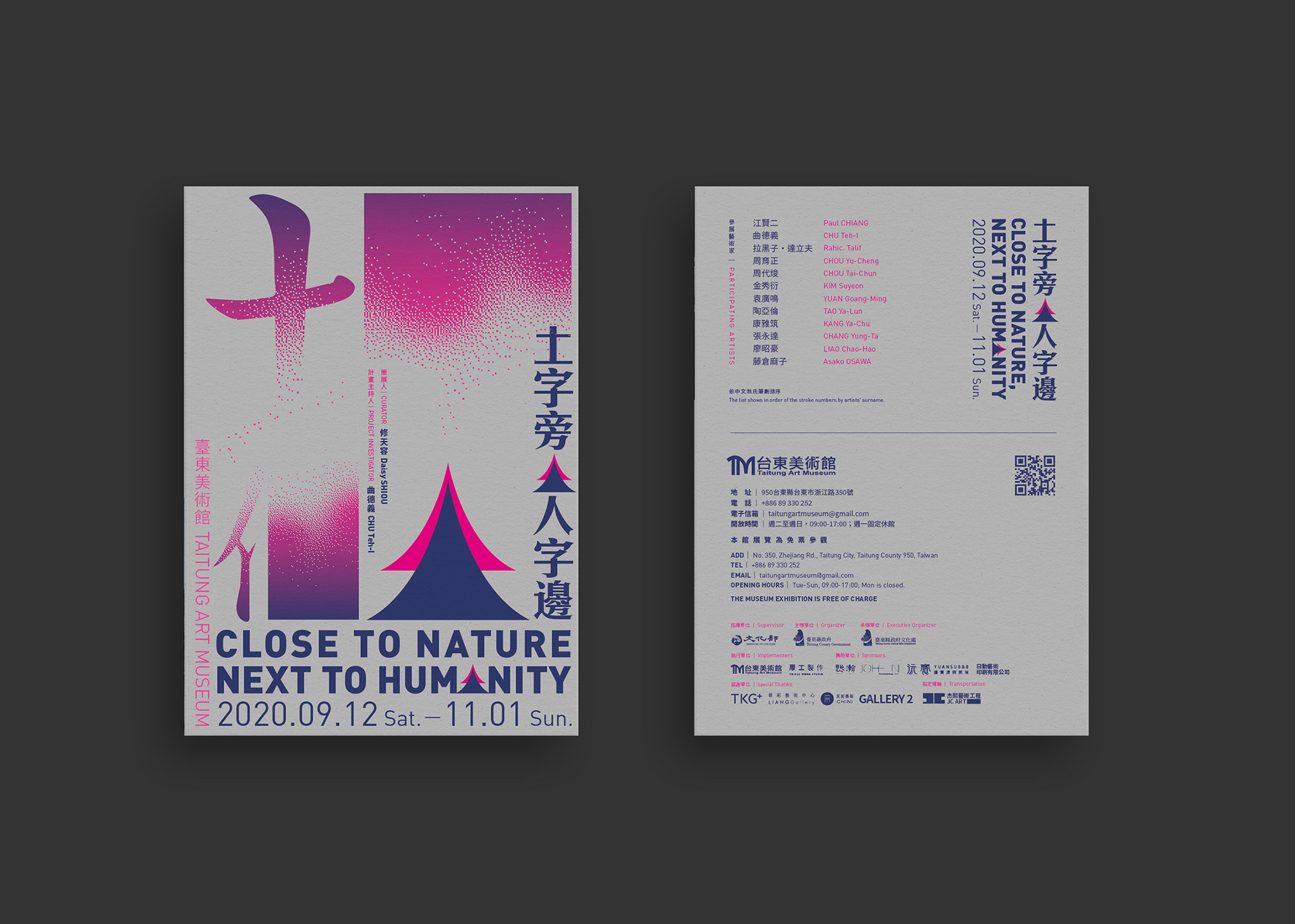
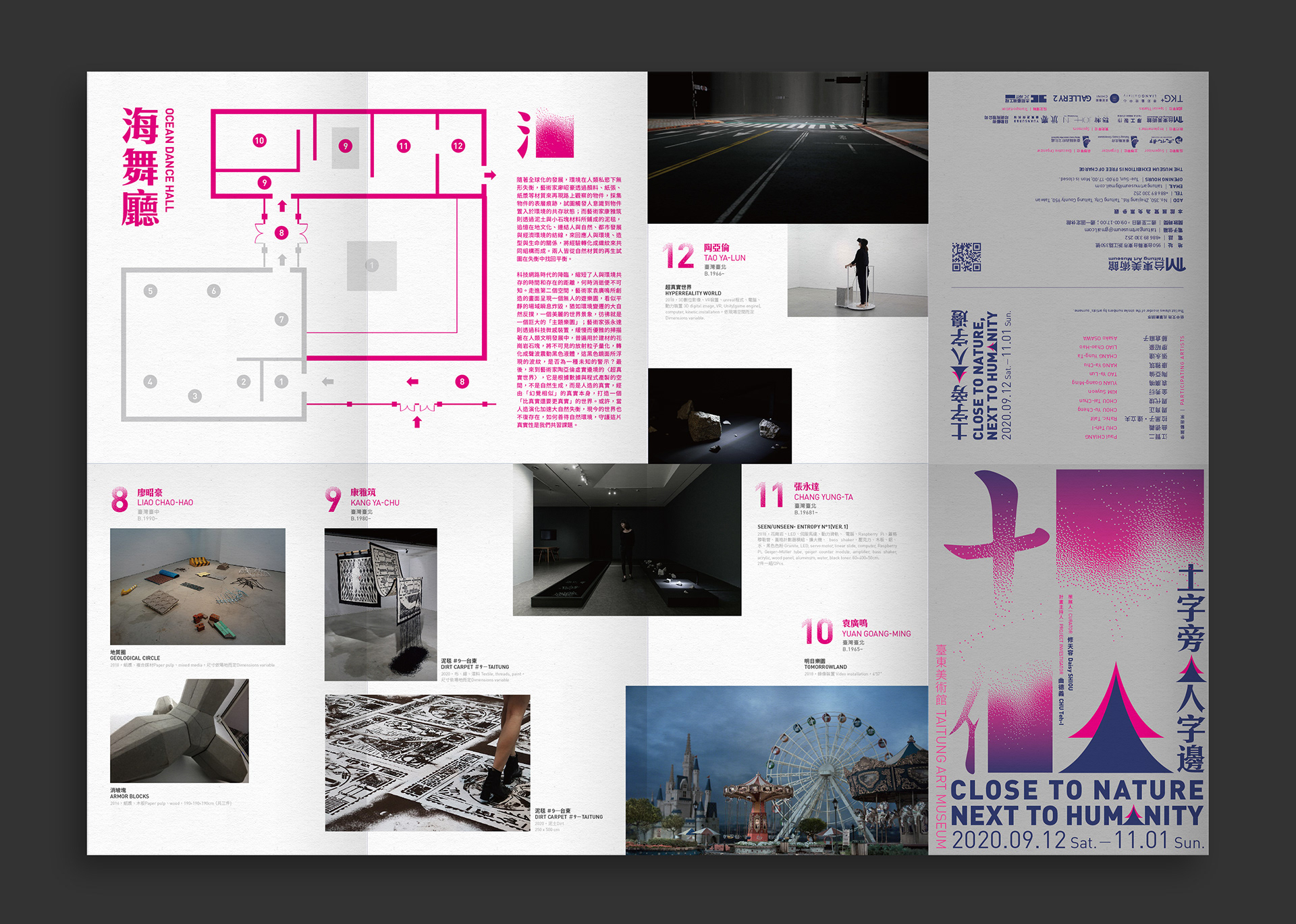
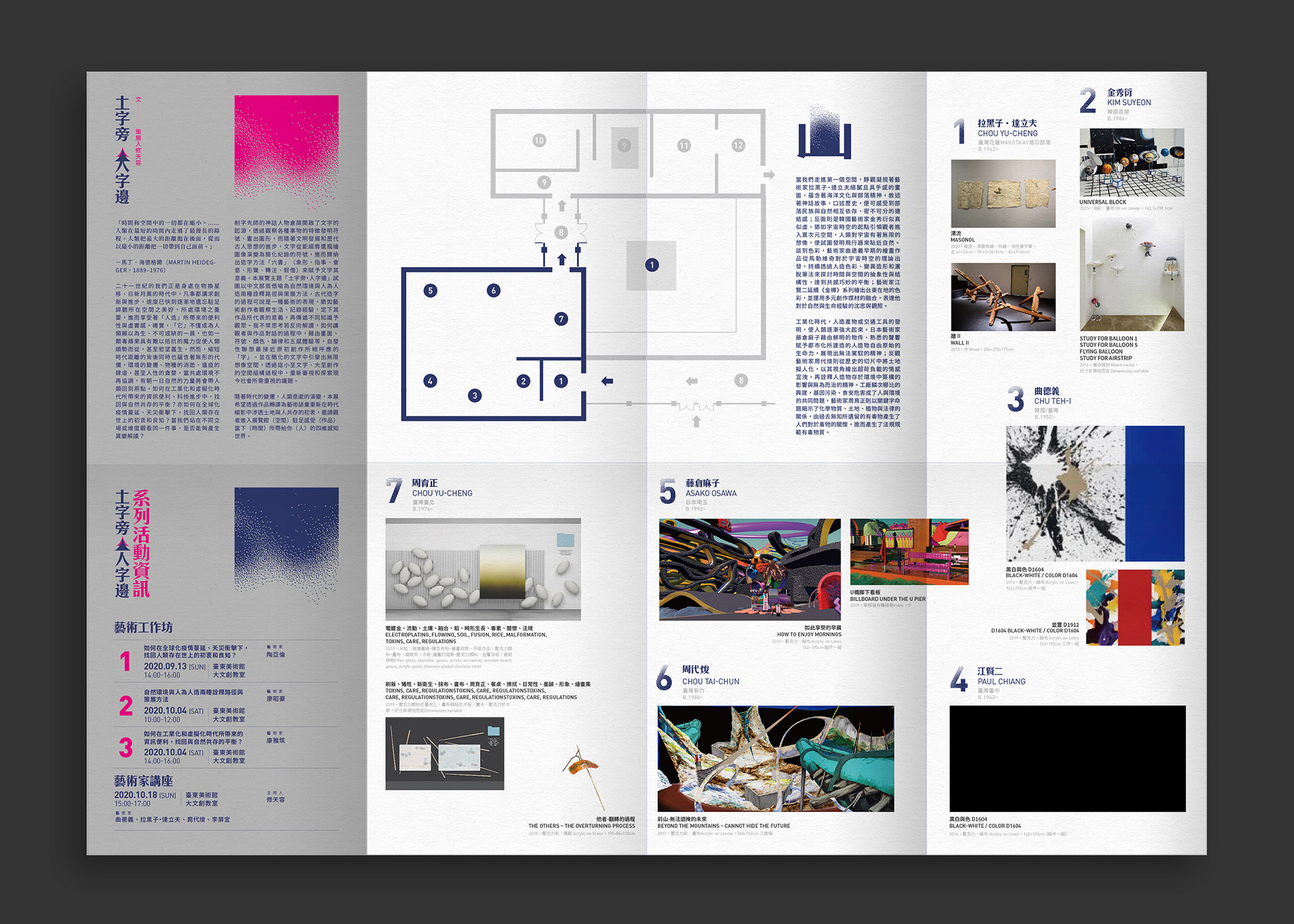
中國造字以「六書」(象形、指事;會意、形聲;轉注、假借)等造字法、組字法和用字法來賦予文字其意義。本展覽主題「土字旁‧人字邊」試圖以中文部首借喻為自然環境與人為人造兩種詮釋作為展覽主題。
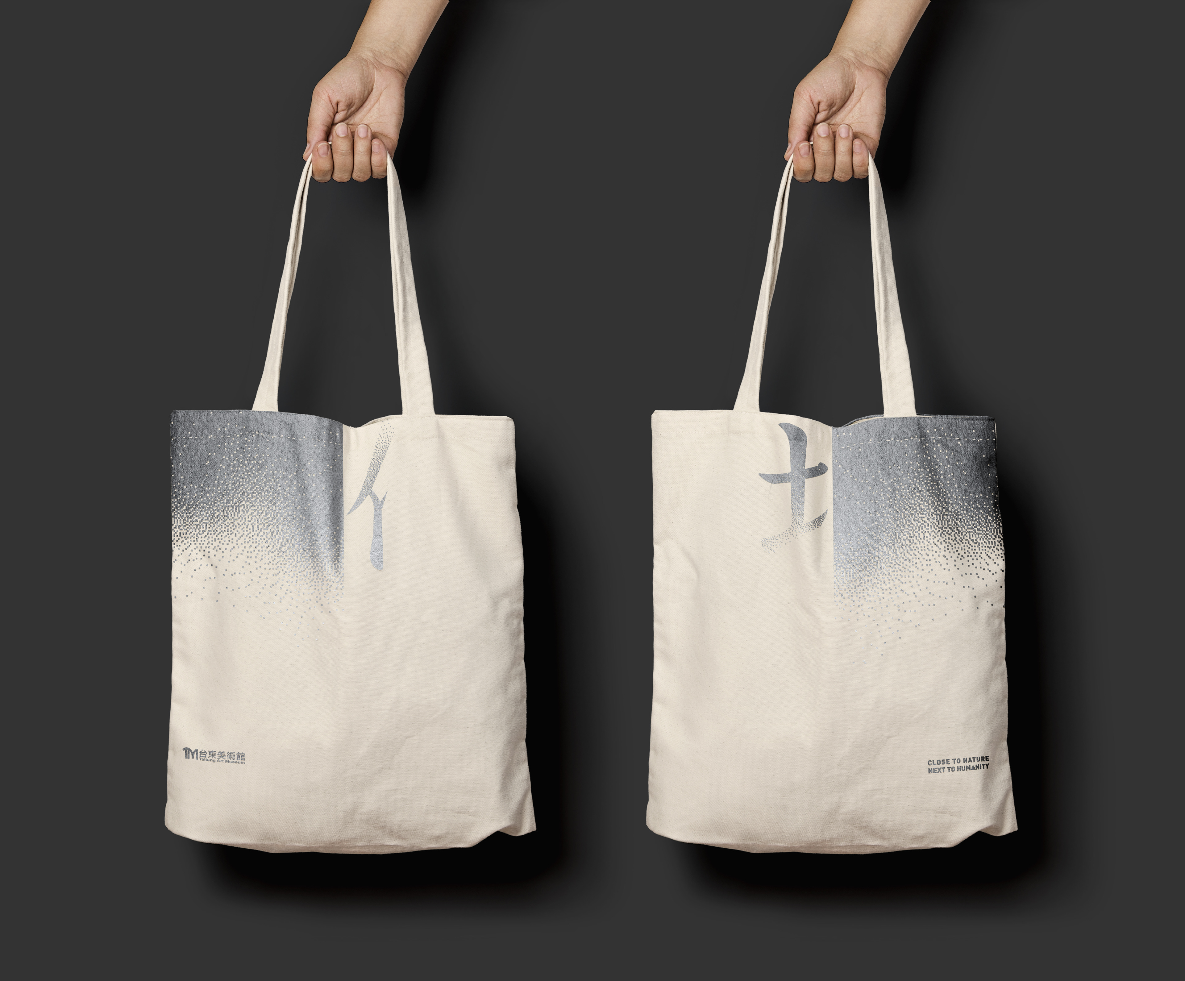
土字旁為中文文字,左邊會有土字部首的單字;而人字邊則為文字左邊會有人字部首的單字,我藉以方塊,取代原本單字右邊該搭配的字,用以表現的展覽名稱。並以山脈的元素表現展覽地點台東的環境,而重疊的山脈又有如『人』字,暗喻人與自然環境的關係。而擴散的像素以及雙特色(銀色、螢光桃紅色)表現出人、自然環境與科技的展覽內容。
The formula of Chinese character is given the words meaning by combination, the theme in this exhibition “Close to Nature, Next to Humanity” try to use Chinese radical metaphor as nature environment and man-made two ways to interpret as theme in this exhibition. “Close to Nature” is about Chinese character “土” on the left as a radical; “Next to Humanity” is about Chinese character “人” on the left, I use square replace original words on right side, and use the concept to express the heading of the exhibition, take element of the mountain to express the environment of exhibition located in Taitung, the shapes of mountains of overlap are Chinese character”人” alike, it metaphors that connection of environment goes with human and nature. Diffuse pixels and two Pantone colors (silver and fluorescent pink) express the human, natural environment and content in exhibition of technology.
〔設計/Designed〕和設計
〔年份/Year〕2020
〔獲獎/Award〕 Taiwan Top Star - Gold Award